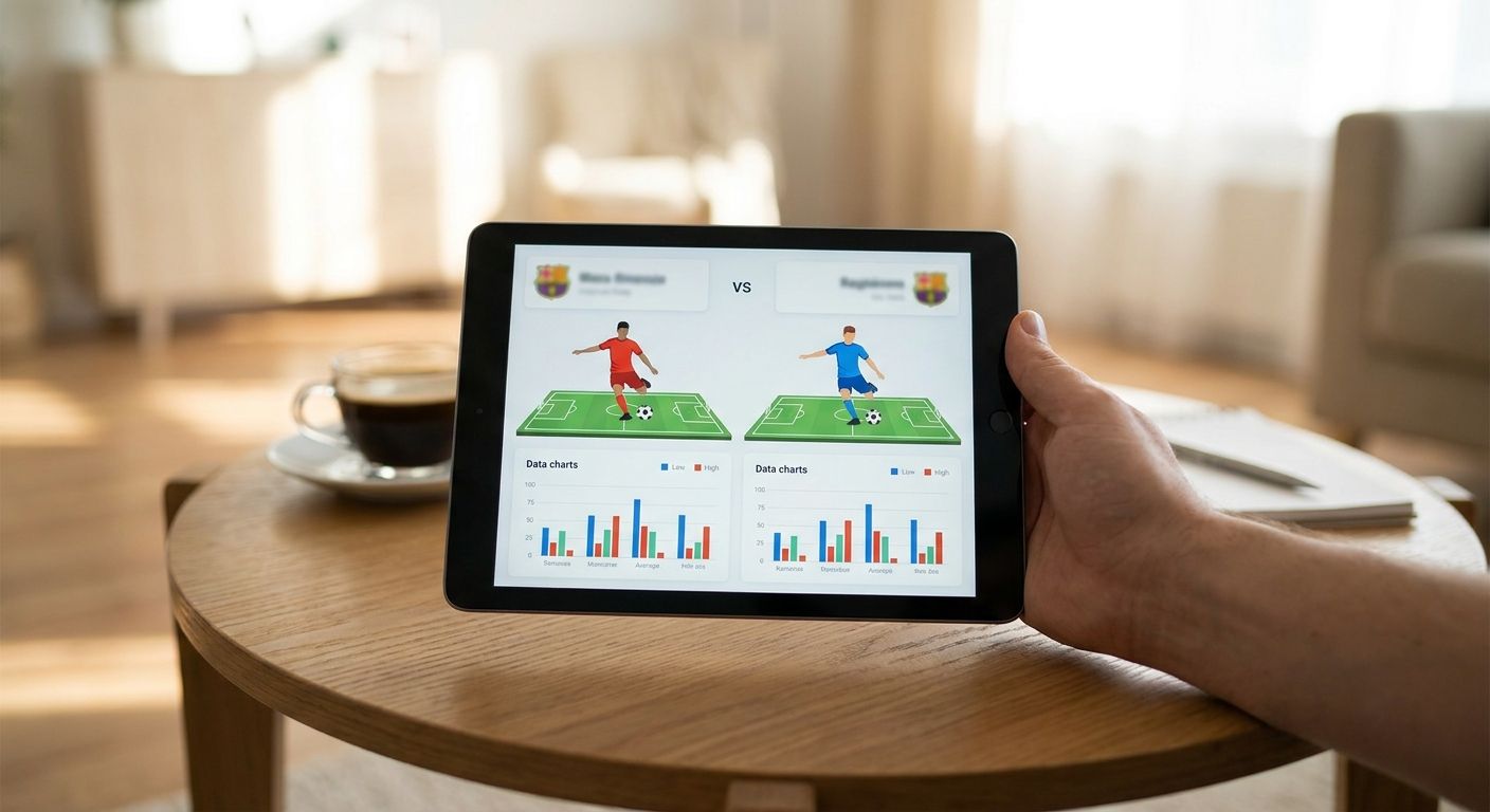
Pulling two MLS player names into a spreadsheet and staring at raw totals tells you almost nothing — minutes played, position, and season stage all distort the numbers before you've drawn a single conclusion. This guide walks through building a fair MLS player stats comparison in 2026, step by step, from setting an eligibility cutoff to picking a chart that actually shows the difference.
- A fair MLS player stats comparison in 2026 starts with a minutes cutoff, not the leaderboard.
- Per 90 metrics and percentile ranks beat raw totals across MLS's 34-game regular season.
- Radar and pizza charts on FBPlot turn raw MLS stats into one shareable side-by-side view.
- Comparing players across positions without adjusting for role produces a false verdict every time.
Why this matters
MLS has 30 clubs playing an unbalanced 34-game regular season in 2026, which means minutes totals vary wildly by matchday and by injury history. A striker with 22 goals in 2,400 minutes and one with 18 goals in 1,600 minutes are not comparable on raw totals — the second player is outscoring the first on a per-90 basis. Get the population and the scaling wrong and every chart you build afterward just restates the mistake in a nicer font.
The fix isn't complicated, but it does need to happen in order: define the question, set eligibility, normalize the numbers, then chart. Skip a step and the FBPlot radar or bar chart you build will look sharp and still mislead.
What you'll need
- A stats source with MLS coverage (season totals plus per-90 or percentile fields)
- A minutes or matches cutoff to exclude small-sample outliers
- Clear position groups — centre backs, full backs, number 8s, wingers, strikers, goalkeepers
- Per-90 or percentile-normalized metrics, not raw totals
- A chart tool that supports radar/pizza, bar, or scatter output — FBPlot covers all three across 107+ leagues on its Pro plan, with the free tier limited to the Top 5 European leagues, so MLS comparisons need the Pro tier
- 15-20 minutes to build and caption one chart properly
The steps
1. Define the comparison question
Write down exactly what you're trying to answer before opening any data: "Which MLS number 10 creates the most high-value chances per 90 in 2026?" is a question you can chart. "Who's better?" is not. A specific question tells you which metrics matter and which players belong in the population — everything downstream depends on getting this sentence right.
Common mistake: starting with the chart type instead of the question, which usually ends with a radar full of metrics that don't answer anything.
2. Set a minutes or matches eligibility cutoff
MLS's 34-game regular season means a full-minutes player logs roughly 3,000+ minutes; anyone under 900-1,000 minutes (about 10 full matches) is working with a sample too small to trust for rate stats. Set the same cutoff for every player in the comparison, no exceptions for a player you already suspect is good.
This single step eliminates most of the noisy outliers that make hot-start rookies look like MVP candidates in April.
3. Group players by position and role
A number 8 and a winger both show up as "midfielder" in some data exports, but their underlying job — and therefore their expected stat profile — is completely different. Build separate comparison groups by role, not by generic position label, before you touch a single metric.
Skipping this step is the fastest way to produce a chart that looks rigorous and says nothing true.
4. Normalize to per 90 and percentile rank
Convert counting stats (goals, key passes, tackles, progressive carries) to per-90 rates, then rank each player as a percentile within their position group and eligibility population. A player at the 85th percentile for progressive passes among MLS full backs in 2026 is a specific, checkable claim — "he passes well" is not.
Percentile framing is also what makes a radar or pizza chart readable at a glance, since every axis runs 0-100 regardless of the underlying metric's scale.
5. Pick the chart type that fits the question
- One player across many metrics: radar or pizza chart
- Many players on one metric: bar chart, sorted high to low
- Two metrics across many players: scatter or swarm plot, with quadrant labels
Matching chart type to question is the difference between a visual someone screenshots and shares versus one they scroll past. The Premier League player comparison guide walks through the same decision tree if you're running comparisons across more than one league.
6. Build the chart
Load the eligible, normalized player set into your chart tool and generate the visual. In FBPlot, this means selecting the MLS competition, the position group, the per-90 metrics or percentiles, and the players — the radar and pizza chart builder renders the comparison in minutes once the inputs are set correctly.
Common mistake: mixing raw totals and percentiles on the same chart, which produces axes that don't mean the same thing and undermines the entire comparison.
7. Add context and a caption
Every chart needs a one-line caption stating the population, the minutes cutoff, the season, and the data date. "MLS midfielders, 1,000+ minutes, 2026 regular season, data as of matchday 28" takes ten seconds to write and lets anyone reproduce your comparison later.
Without that caption, the chart is a pretty image with no way to check it — and no way for you to defend it when someone asks why a player isn't included.
8. Share and archive the version
Export the chart, save the underlying data cutoff, and post it with the caption intact. If the comparison gets picked up or challenged, having the exact population and cutoff on hand settles the argument in one reply instead of a re-run.
Build the comparison chart now
Design MLS radar and bar charts from real player data in minutes.
Troubleshooting
- Raw totals favour the ironman, not the better performer: switch to per-90 rates before ranking anyone.
- Small samples make April look like a breakout: apply the 1,000-minute cutoff before including a player in any 2026 season comparison.
- Cross-position comparisons produce a false winner: re-run the comparison within a single role group.
- MLS not showing up in a free-tier chart tool: MLS sits outside the Top 5 European leagues most free tiers cover, so a Pro plan or MLS-inclusive tool is required — FBPlot's Pro plan covers MLS alongside 107+ competitions.
- Playoff minutes inflating a late-season chart: decide upfront whether the comparison covers regular season only or includes playoffs, and label it in the caption.
- Metric definitions differing between data sources: confirm both players' numbers come from the same provider before charting them together.
Tools and resources
- Position-specific per-90 and percentile data for the season you're comparing
- FBPlot for radar, pizza, bar, and scatter charts across MLS and 106 other competitions
- A written eligibility rule (minutes, matches, season window) saved alongside every chart you publish
- The Brasileirão comparison walkthrough for the same methodology applied to another non-Top-5 league
What to do next
Once the MLS comparison chart is built and captioned, run the same eligibility-then-normalise-then-chart sequence on the next question you have — a new signing versus the player they're replacing, or a shortlist of three wingers ahead of a trade window. The steps don't change; only the population and the metrics do.
FAQ
What's the best way to compare MLS player stats side by side?
Set a minutes cutoff, group players by role, normalise to per-90 or percentile, then chart with a radar or bar chart. Skipping the cutoff or the position grouping is what makes most MLS player stats comparisons misleading.
How many minutes should a player have before including them in an MLS comparison?
Most analysts use 900-1,000 minutes, roughly 10 full matches, as a floor for per-90 rate stats in a 34-game MLS season. Below that, small-sample variance overwhelms the signal.
Is a radar chart or a bar chart better for comparing MLS players?
Use a radar or pizza chart for one player across multiple metrics, and a bar chart for many players on a single metric. Picking the wrong one is the most common reason a chart looks technical but doesn't answer the question.
Can you compare MLS players to players in other leagues?
Yes, if both are normalised to per-90 or percentile within their own league and position group first. Comparing raw totals across leagues with different schedule lengths produces a distorted result.
How much does an MLS player stats comparison tool cost in 2026?
Free tiers on most chart tools cover only the Top 5 European leagues, so MLS coverage usually requires a paid tier. FBPlot's Pro plan unlocks MLS and 107+ competitions for chart building.
Should playoff stats be included in a season-long MLS comparison?
Decide upfront and state it in the chart caption. Mixing regular season and playoff minutes without labelling the difference makes the comparison impossible to reproduce or verify.
What metrics matter most for comparing MLS attackers?
Per-90 non-penalty goals, expected goals, key passes and progressive carries cover most attacking roles. The right mix depends on the specific role, since a winger and a striker need different metric weightings.
One last thing
MLS runs a 34-game regular season in 2026, longer than several European top flights, which means a 1,000-minute eligibility cutoff still leaves plenty of players excluded from a fair comparison in the first two months of the campaign. Patience with the cutoff matters more than speed to publish.