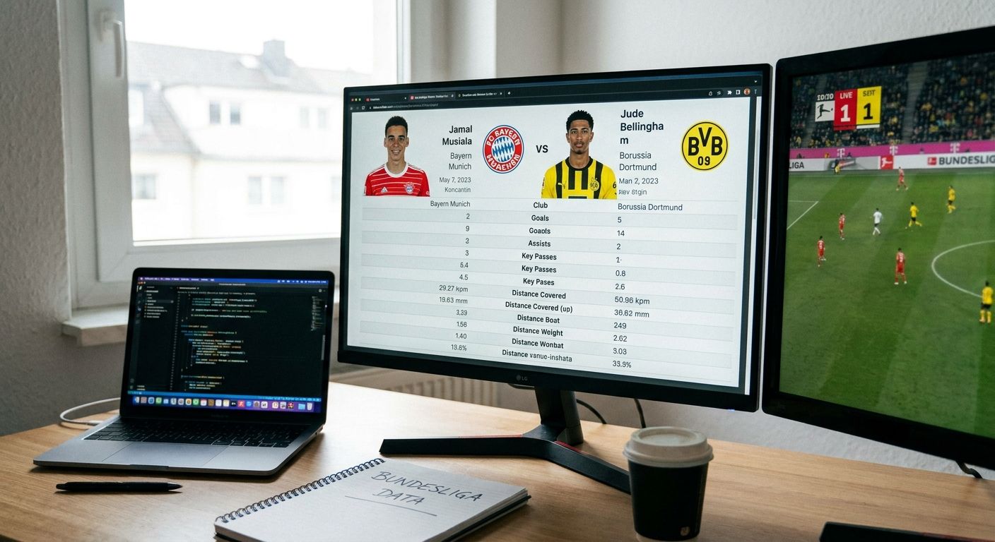
Comparing Bundesliga player stats side by side only works when the population, the metrics, and the chart type all match the question you're actually asking — get any one of those wrong and the comparison lies to you before you've even labeled an axis.
- A fair bundesliga player stats comparison starts with matched positions and a minutes cutoff, not raw totals.
- Use per-90 or percentile metrics inside one competition population — mixing Bundesliga with Champions League minutes skews the read.
- 900 minutes (roughly 10 full matches) is a reasonable floor before a 2026 Bundesliga sample is worth charting.
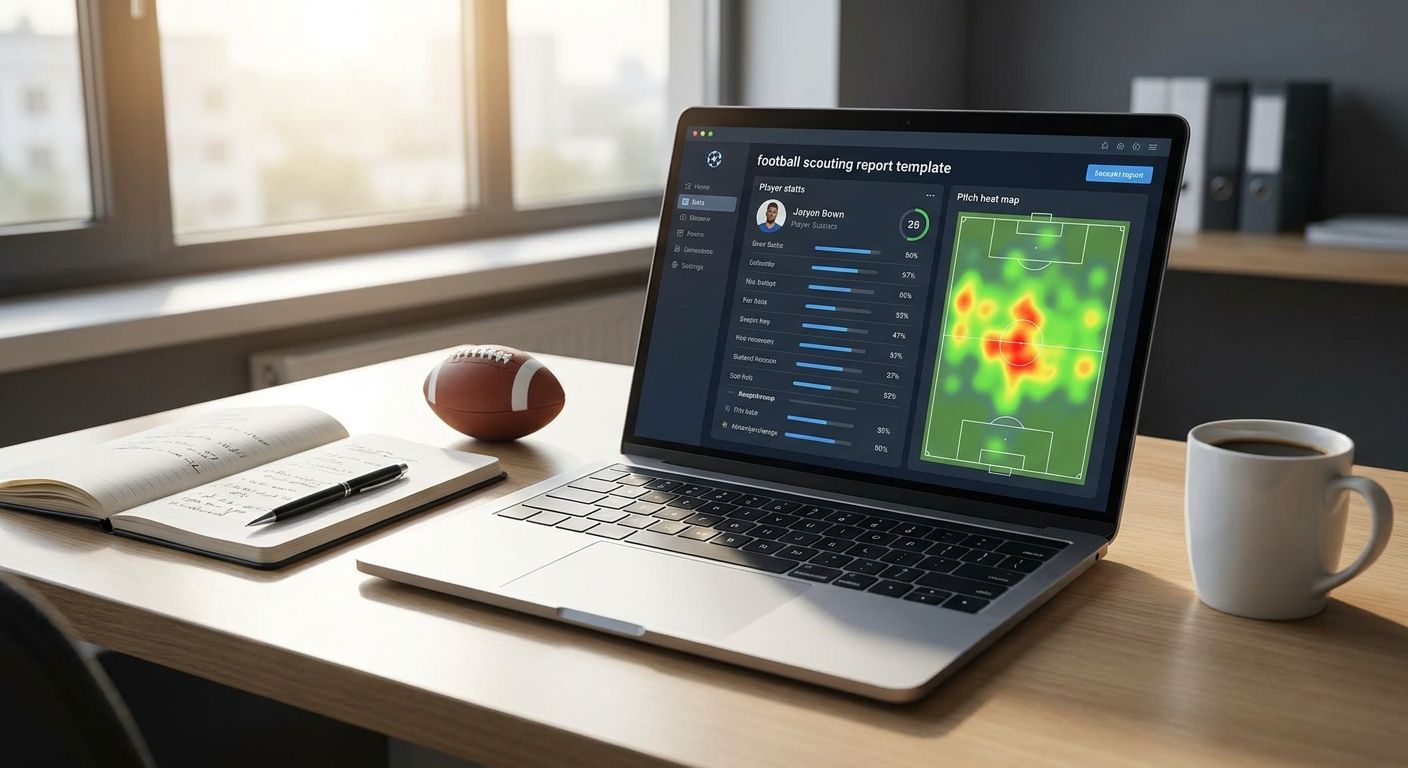
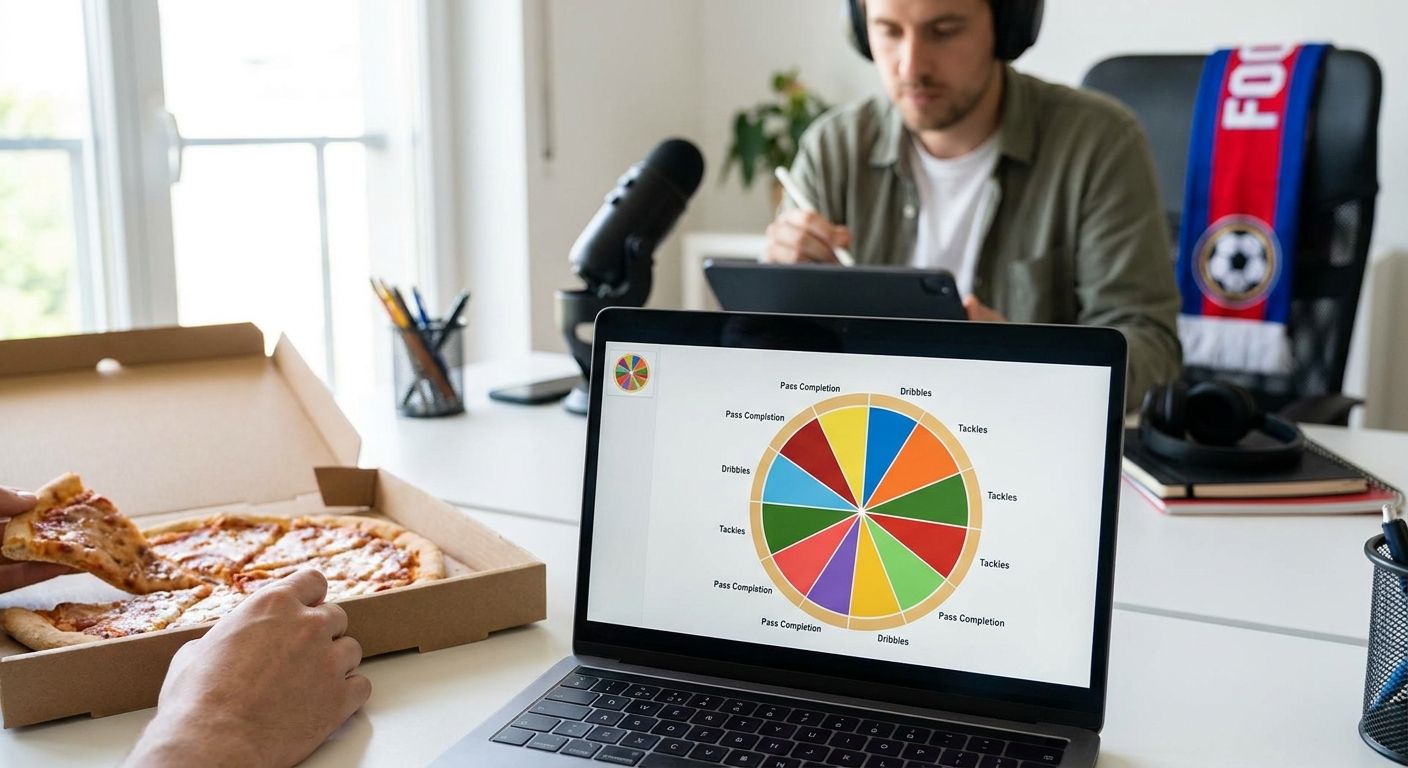
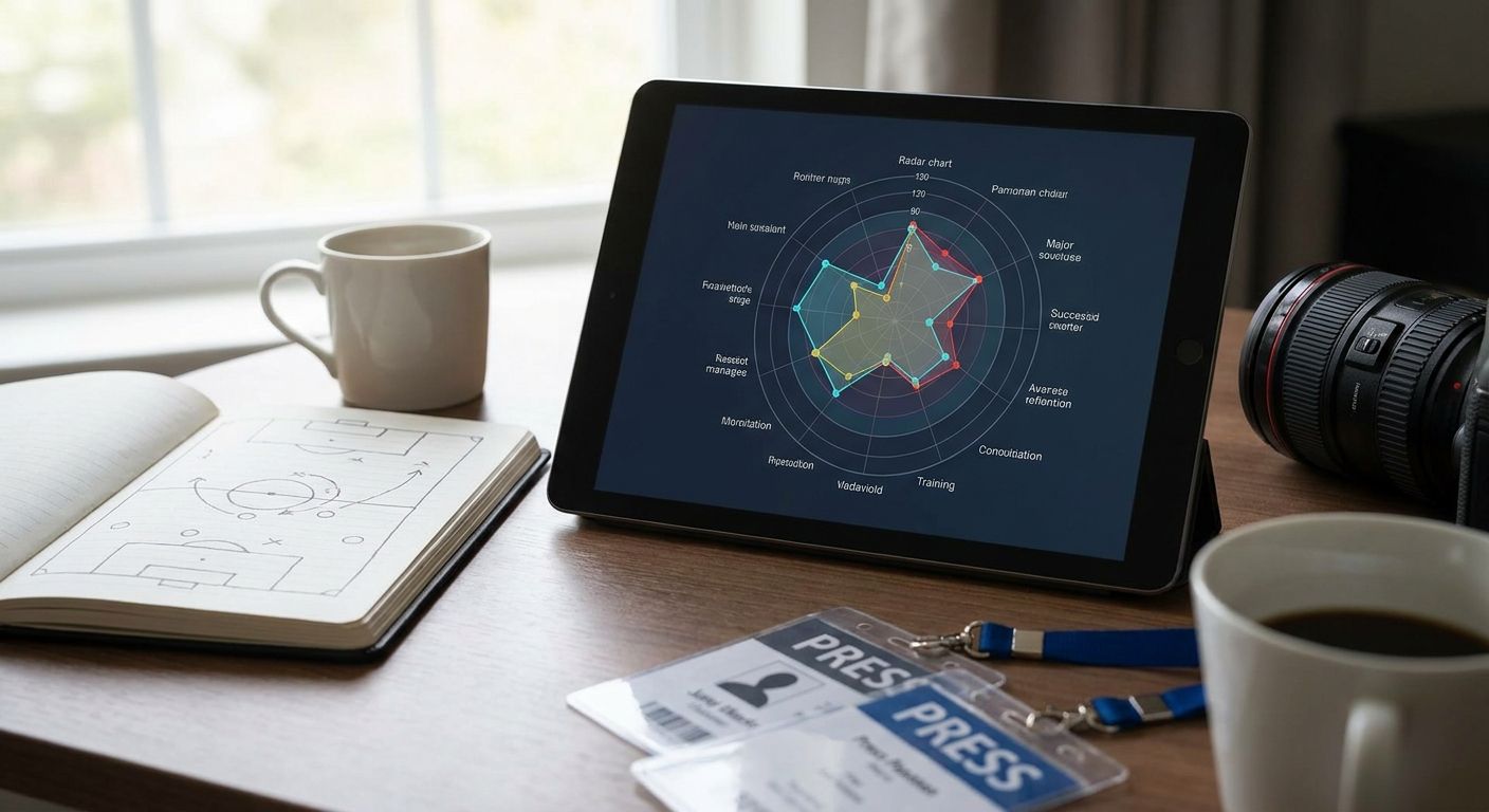
- Radar and pizza charts in FBPlot turn a matched comparison into a shareable visual in minutes, not spreadsheets.
Why this matters
Bundesliga data is easy to pull and easy to misread. Eighteen clubs, a 34-matchday season, and several competitions overlapping in any given year mean two players' "stats" often describe different things entirely — different roles, different sample sizes, different opponent strength.
A side-by-side chart makes a bad comparison look authoritative. That's the risk: a radar chart with mismatched populations gets shared and cited before anyone checks the underlying filters. Fixing the comparison before you visualise it is the actual skill — the chart is just the last step.
What you'll need
- A player data source with Bundesliga coverage for the current season (2026 Bundesliga data, not last season's carryover)
- A defined position group for each player you're comparing (a false 9 and a target man are not the same role)
- A minutes or matches cutoff to exclude small-sample noise
- A decision on competition scope — Bundesliga only, or Bundesliga plus European minutes
- A chart type suited to the comparison: radar/pizza for multi-metric profiles, bar for single-metric ranking, scatter for two-variable trade-offs
- FBPlot or an equivalent tool that builds shareable radar, pizza, bar and scatter charts from that data
The steps
1. Write down the exact question first
A bundesliga player stats comparison without a question turns into a fishing exercise. "Who presses harder, Player A or Player B" is a question; "compare these two players" is not.
Name the decision the chart needs to support — scouting shortlist, broadcast graphic, fan debate — before picking a single metric. This determines everything downstream, including which chart type actually answers it.
Common mistake: starting in the chart tool before the question is written down. You'll end up rebuilding the chart three times.
2. Set the eligible population
Matched position, matched competition, consistent time window. A centre-back and a wing-back should never share a radar built on defensive volume metrics — their roles generate that volume differently.
Decide whether you're comparing Bundesliga-only minutes or total 2026 season minutes across all competitions. Mixing the two without saying so is the single most common way a comparison misleads a reader.
Common mistake: comparing one player's Bundesliga numbers against another player's all-competition numbers without flagging it.
3. Apply a minutes cutoff before you chart anything
A player with 320 minutes in the 2026 Bundesliga season doesn't have a stable per-90 rate yet. Treat 900 minutes — roughly 10 full matches — as a reasonable floor for headline metrics like shots or progressive passes, and extend it further for low-frequency events like goals.
Below that threshold, either exclude the player or label the chart clearly as a small-sample view. Skip the temptation to chart raw totals for a player who's only played six matches.
4. Pick per-90 or percentile metrics that match the role
Raw totals reward playing time, not quality. Per-90 rates normalise for minutes; percentiles rank a player against a role-specific peer group, which is what most radar and pizza charts actually display.
For a Bundesliga winger that means progressive carries, touches in the box and successful take-ons per 90 — not tackles won, which belongs on a different player's profile. Choosing metrics for the role, not for the player, is what keeps the comparison honest.
5. Choose the chart type for the question you defined in step 1
A radar or pizza chart works for a multi-metric role profile — six to twelve metrics on one shape, one player overlaid against another. A bar chart works better for a single-metric ranking across a squad. A scatter or swarm plot is the right call when you're testing a trade-off, like progressive passes against turnovers.
Build the comparison in FBPlot, which covers Bundesliga inside its Top 5 leagues free tier and extends to all 107+ tracked leagues on the Pro plan if you need cross-league benchmarking later. Use the chart type that matches the question — don't force a 12-metric radar onto a single-stat argument.
6. Add the context layer before you publish
A number alone doesn't tell a reader whether it's good. Percentile shading against a Bundesliga positional peer group, or a caption noting opponent strength, turns a raw comparison into something a reader can trust without asking follow-up questions.
Note the data cutoff date directly on the chart. "As of matchday 20, 2026 season" is one line, and it stops someone citing a stale snapshot as current.
7. Label axes and write a one-line caption
Every axis needs its unit — per 90, percentile or raw count — stated, not implied. A caption should give the population, the cutoff and the source in a single sentence anyone can quote without more context.
This is the step most side-by-side comparisons skip, and it's the reason charts get screenshotted out of context and misused.
8. Share it, then version it
A Bundesliga comparison from matchday 10 is a different chart by matchday 25. Date-stamp the version, save the filter settings, and rebuild rather than editing the old chart in place when the underlying data moves.
Build your Bundesliga comparison
Set the population, pick per-90 metrics, and chart it in minutes.
Troubleshooting
- Comparison looks lopsided for no obvious reason — check whether both players share the same position tag. A nominal winger playing as a wing-back skews every attacking metric.
- One player's numbers jump week to week — the sample is still under 900 minutes. Widen the cutoff or add a small-sample label to the chart.
- Metrics don't line up on the radar — you're mixing Bundesliga-only stats with all-competition stats for different players. Pick one scope and apply it to both.
- Percentile ranks look inflated — the reference population is too narrow, often filtered to one club instead of the full Bundesliga positional pool.
- Chart looks fine but a reader disputes it — the caption is missing the data cutoff date. Add it and the dispute usually ends there.
- Colours are hard to tell apart on the overlay — two-player radar overlays need genuinely distinct hues, not two shades of the same colour.
Tools and resources
- FBPlot for building the radar, pizza, bar and scatter charts once the population and metrics are set
- A Bundesliga-specific position taxonomy (winger vs inverted winger vs wing-back) rather than a generic position label
- A minutes and matches tracker per player, to enforce the 900-minute cutoff before charting
- A dated note documenting the filters used, so the same comparison can be rebuilt later under identical rules
What to do next
If the same reader also wants to compare Premier League players, the population and metric logic carries over almost unchanged — only the league-specific eligibility norms shift. The Premier League side-by-side comparison guide walks through that version step by step.
FAQ
What's the best way to do a bundesliga player stats comparison?
Match position and competition scope first, apply a minutes cutoff around 900 minutes, then compare per-90 or percentile metrics on a radar or bar chart. Skipping the population step is the most common source of a misleading comparison.
Is per-90 better than raw totals for comparing Bundesliga players?
Per-90 rates are better when players have different minutes totals because they normalise for playing time. Raw totals only make sense when both players have logged close to the same minutes in the 2026 season.
How many minutes do I need before a Bundesliga stat is reliable?
Around 900 minutes, roughly 10 full matches, is a reasonable floor for headline metrics like shots or progressive passes. Low-frequency events such as goals need a longer window before the rate stabilises.
Can I compare Bundesliga and Premier League players on the same chart?
Yes, but the caption must state that the comparison crosses competitions, and the percentile population should be defined explicitly. FBPlot covers both leagues plus 107+ others, so cross-league comparisons are available on the Pro plan.
What chart type works best for comparing two Bundesliga players?
A radar or pizza chart works best when comparing six or more metrics across two players in the same role. A bar chart is better for ranking a single metric across a full squad.
Should I use raw stats or percentiles for a scouting report?
Percentiles are usually stronger for scouting because they rank a player against a role-specific peer group instead of an absolute number. State the reference population on the chart so a reader can judge how fair that ranking is.
How often should a Bundesliga comparison chart be updated?
Rebuild it whenever the data cutoff moves meaningfully, such as every five to ten matchdays across the 2026 season. Date-stamp each version rather than editing the same chart in place.
Does competition scope matter when comparing Bundesliga stats?
Yes. Mixing Bundesliga-only minutes with all-competition minutes for different players is one of the most common ways a comparison misleads. Pick one scope and apply it consistently to both players.
One last thing
The fastest way to spot a bad Bundesliga comparison isn't the chart — it's the caption. If a chart can't state its population, cutoff and metric units in one sentence, the comparison underneath it probably isn't as fair as it looks.