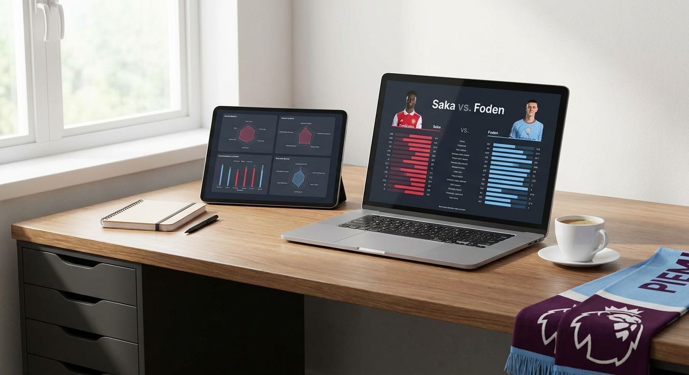
Comparing Premier League player stats side by side only works when you pick metrics that mean something for the position, normalize for minutes played, and put the numbers on one visual instead of five browser tabs.
- Premier league stats comparison works best on per-90 metrics, not raw season totals, for players with different minutes.
- FBPlot builds radar, bar, and scatter charts from Premier League data for free in 2026 across the Top 5 leagues.
- Percentile ranks against positional peers catch real differences that raw stats hide.
- The Pro plan unlocks all 107+ leagues on FBPlot when the comparison needs to go beyond England.
Why this matters
A spreadsheet full of goals, assists, and pass completion tells you almost nothing about how two Premier League players actually compare. Raw totals reward minutes played, not quality, and a midfielder with 2,800 minutes will always out-tackle one with 1,100 even if the second player is sharper per appearance.
A proper premier league stats comparison in 2026 needs three things: metrics that fit the position, numbers adjusted for playing time, and a chart that shows the gap instead of forcing you to subtract columns in your head. Scouts, journalists, and fans who skip the normalization step end up comparing playing time, not skill.
What you'll need
- Two or more player names from the same or comparable positions
- A stat category list relevant to that position (progressive passes for a full-back, xG and shot-creating actions for a forward)
- A charting tool that pulls Premier League data and builds radar, bar, or scatter visuals — FBPlot covers this on its free tier
- 10 to 15 minutes
- A browser tab, nothing else
The steps
1. Define the comparison question before touching data
Decide what you're actually trying to answer: is Player A a better presser, a better final-third passer, or just more durable? A vague goal produces a cluttered chart with 12 metrics nobody can read.
Write the question down in one sentence. "Who creates more high-value chances per 90" is a chart. "Who is better" is not.
Common mistake: picking every available stat because it's there, instead of the 5-6 that answer the question.
2. Pull per-90 stats, not season totals
Raw totals favor players with more minutes on the pitch, full stop. Convert every counting stat — tackles, key passes, shots, touches in the box — to a per-90 basis before you compare anything.
This single step fixes most bad comparisons. A striker with 1,400 minutes and a 0.55 xG per 90 is outperforming one with 2,600 minutes and a 0.38 xG per 90, even though the second player's season total looks bigger on paper.
3. Build a radar or pizza chart for the shape of the comparison
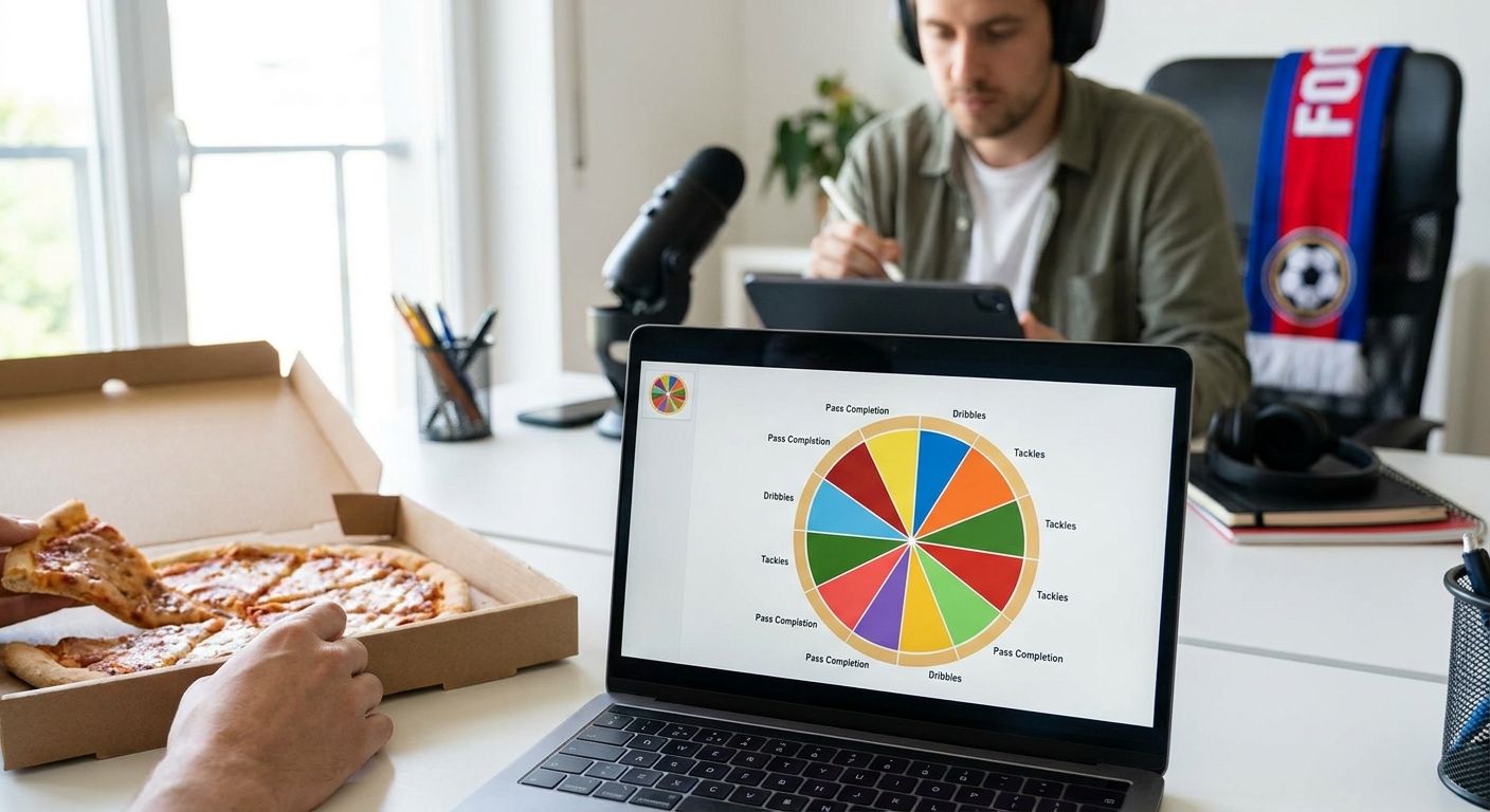
Radar charts (also called pizza charts) are built for exactly this job: overlapping two or more players across the same 6-10 metrics on one shape. FBPlot generates these directly from Premier League data on the free tier in 2026, so there's no manual chart-building involved.
Pick metrics from a single category cluster — passing, defending, or attacking — rather than mixing all three, or the chart reads as noise instead of a story.
Common mistake: comparing a center-back to a winger on the same radar. Positional context is what makes percentile ranks meaningful; cross-position radars just produce a lopsided shape with no insight.
4. Add a scatter or swarm plot for the outlier check
A radar chart shows shape; a scatter plot shows where a player sits against the whole league on two axes at once — say, progressive carries versus dispossessions. This catches players whose radar looks good but who are outliers on volume or risk.
Swarm plots do the same job when you want to see a player against a full distribution of positional peers rather than just two axes. Use scatter or swarm as the second chart, never the only chart — a single scatter plot without the radar context loses the multi-metric picture.
5. Normalize for sample size, not just minutes
A player with 400 minutes can post an inflated per-90 rate off a hot streak. Check total minutes and appearances alongside the per-90 number before drawing a conclusion — anything under roughly 900 minutes in a season needs a caveat attached to it.
This is the step most casual comparisons skip, and it's why a small-sample breakout player looks better on a radar than a proven 3,000-minute starter until you check the underlying volume.
6. Export and share the finished comparison
Once the radar and scatter agree on the story, export the chart and share it rather than the raw numbers. A chart travels on social media and in reports; a spreadsheet doesn't.
Label the chart with the season and competition explicitly — "2025/26 Premier League, per 90" — so anyone downstream isn't guessing at the timeframe.
Build your first comparison chart
Free radar and scatter charts for the Premier League and the rest of the Top 5 leagues.
Troubleshooting
- The radar looks lopsided with one huge spike. Check whether that metric is a rate stat inflated by low minutes — cap the comparison to players with similar playing time or add a minutes-played footnote.
- Two players from different positions look wildly mismatched. They're not comparable on that metric set. Rebuild the radar with position-appropriate stats instead of a generic template.
- The comparison only covers Premier League and four other leagues. That's the free tier boundary in 2026 — a Pro plan unlocks all 107+ leagues on FBPlot if the comparison needs a player from outside the Top 5.
- Scatter plot is unreadable with too many dots. Filter to a single position group or a minutes threshold before plotting; 300+ dots on one scatter defeats the purpose.
- Numbers don't match what you saw elsewhere. Confirm both sources use the same competition scope (league-only versus all competitions) and the same season window — this is the most common mismatch in premier league stats comparison work.
Tools and resources
- Radar/pizza chart builder for position-based comparisons
- Bar chart builder for straightforward per-90 or percentile side-by-sides
- Scatter and swarm plot builder for outlier and distribution checks
- Free tier covering the Top 5 leagues, including the Premier League, in 2026
- Pro plan for comparisons across all 107+ covered leagues
FBPlot bundles all three chart types under one workspace, which matters when a single comparison needs a radar for shape and a scatter for the sanity check.
What to do next
Once the per-90 and percentile comparison is built, the next useful move is stacking three or four players on the same radar instead of two — that's where positional benchmarking starts to look like actual scouting output rather than a head-to-head. FBPlot supports multi-player overlays on the same chart, so the workflow above scales without switching tools.
FAQ
What's the best way to do a premier league stats comparison?
Convert every counting stat to per-90 first, then compare on a radar chart limited to one metric cluster like passing or defending. Raw season totals mislead because they reward playing time over quality.
Is a radar chart better than a table for comparing players?
A radar chart shows the shape of a player's profile across 6-10 metrics at once, which a table can't do at a glance. Use a table for exact figures and a radar for the overall comparison.
How much does a Premier League stats comparison tool cost?
FBPlot's free tier covers the Top 5 leagues, including the Premier League, at no cost in 2026. The Pro plan is required only for comparisons involving the other 100+ covered leagues.
Can you compare players in different positions?
Not meaningfully on the same radar, since the relevant metrics differ by role. Compare a center-back to a center-back and a winger to a winger, not across position groups.
How many minutes played are enough for a fair comparison?
Roughly 900 minutes in a season is a reasonable floor before per-90 rates stabilize. Anything below that should carry a small-sample caveat next to the chart.
What's the difference between a scatter plot and a swarm plot?
A scatter plot places players on two axes, useful for spotting outliers on volume versus efficiency. A swarm plot shows one metric against the full distribution of a position group, useful for percentile context.
Do I need Pro to compare Premier League players?
No. The Premier League sits inside the free Top 5 leagues tier on FBPlot in 2026, so a straightforward Premier League comparison needs no upgrade.
Why do two sources show different stats for the same player?
Check whether one source counts all competitions and the other counts league-only appearances, and confirm the season window matches. That mismatch accounts for most stat discrepancies between sites.
One last thing
The single biggest error in amateur comparisons isn't picking the wrong metrics — it's comparing two players whose minutes differ by 1,000+ without saying so out loud. Put the minutes-played number next to every radar chart in 2026, and half the arguments about "who's better" resolve themselves before anyone opens a reply thread.