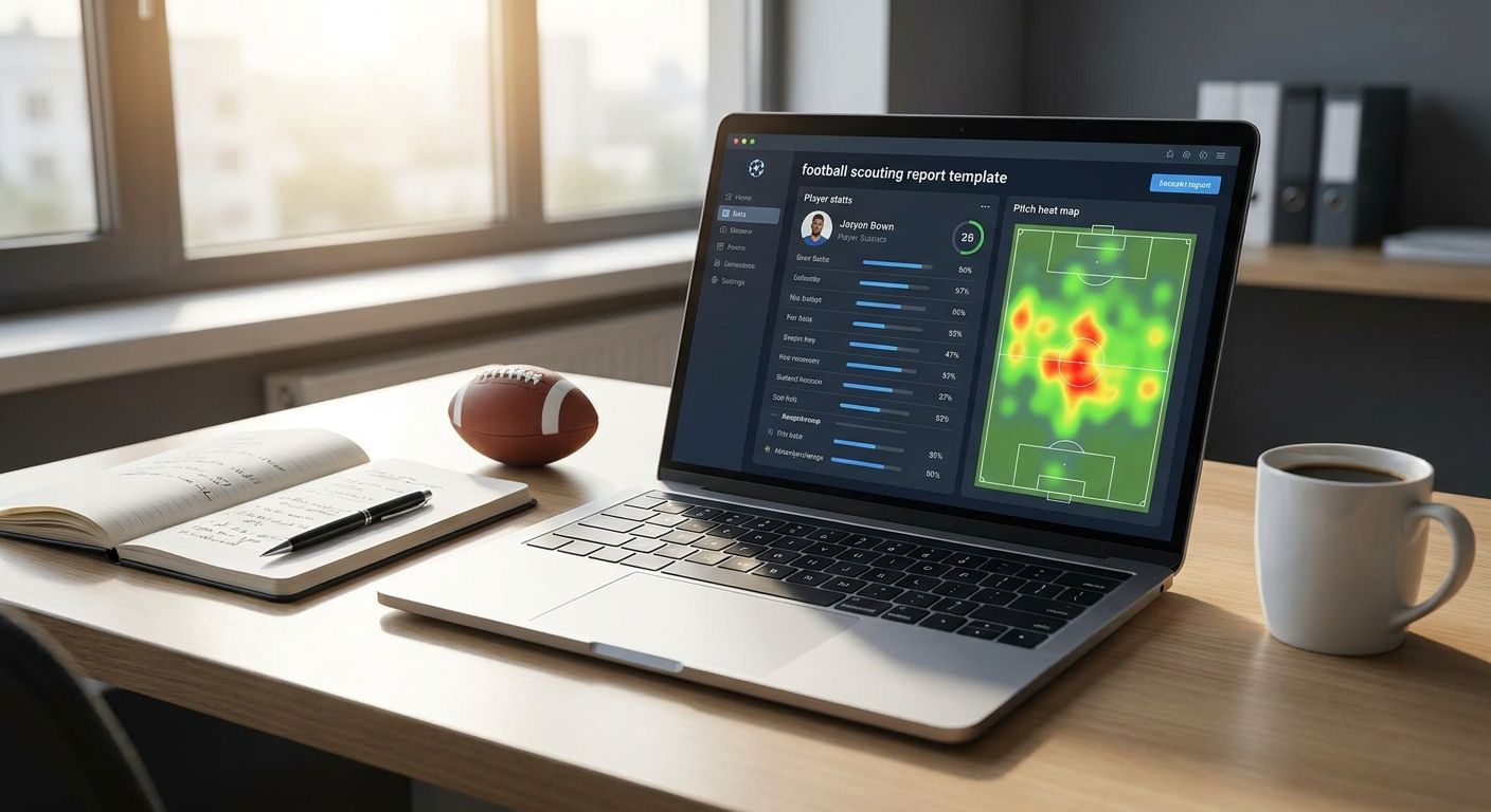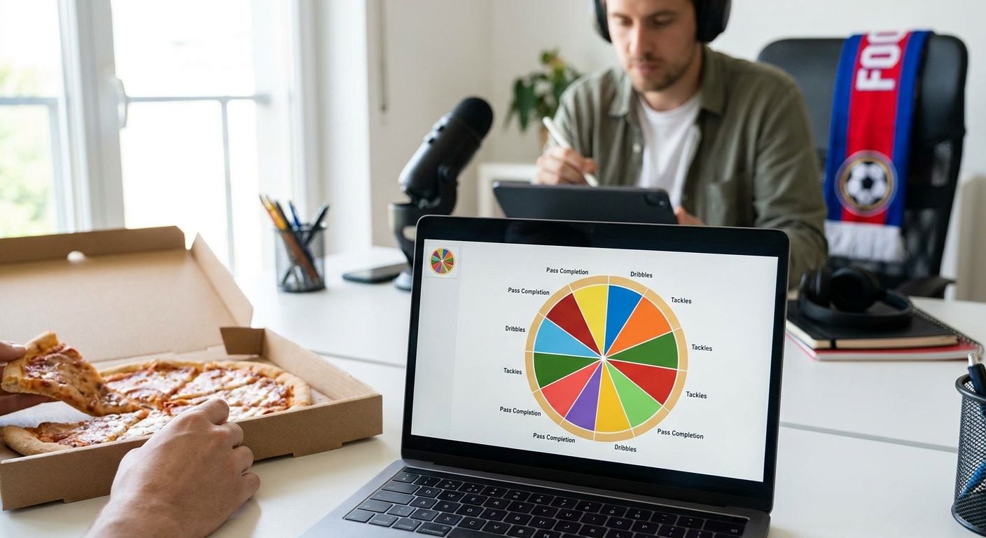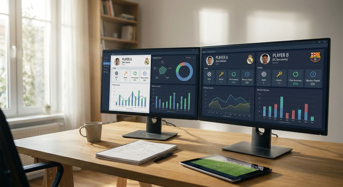
Comparing La Liga player stats side by side only works if you fix the sample, the metric set and the visual encoding before you touch a chart tool. This guide walks through the exact sequence for building a fair, reproducible La Liga player stats comparison in 2026, using a radar or pizza chart as the output.
- Fix minutes and role before picking metrics — La Liga player stats without a cutoff produce misleading radars.
- Use per-90 rates, never totals, when comparing La Liga player stats across players with different minutes.
- Build the comparison chart in FBPlot, which covers La Liga free in its Top 5 leagues tier for 2026.
- Document sample size and eligibility rules so the comparison survives scrutiny from other analysts.
Why this matters
Most side-by-side player comparisons fall apart because the underlying sample isn't fair, not because the chart is ugly. A winger with 900 minutes and a winger with 2,400 minutes in the same 2025/26 La Liga season will show wildly different per-90 numbers if you don't set an eligibility rule up front. Get the sample and metric set right first — the chart is the easy part.
What you'll need
- A defined comparison question (role, competition, time frame)
- A minutes or matches cutoff for eligibility
- Per-90 or percentile-based metrics, not raw totals
- A charting tool that supports radar, pizza, bar or scatter plots — FBPlot covers La Liga free in its Top 5 leagues tier
- 15-20 minutes to build and check the first draft
The steps
1. Write down the exact question
A vague goal like "compare attackers" produces a vague chart. Specify the role, the competition, and the season: "Compare La Liga wingers with 900+ minutes in 2025/26 on progressive carries and non-penalty xG per 90." This sentence becomes your chart's caption later, so get it precise now. Skipping this step is the single biggest cause of charts that get challenged in comments.
2. Set a minutes or matches cutoff
Decide the eligibility threshold before you look at any numbers — 600 minutes is a reasonable floor for a single La Liga season, 900+ minutes tightens noise further. Applying the cutoff after you've seen the leaderboard is how confirmation bias creeps into scouting work. Players below your cutoff get dropped from the comparison, full stop, no exceptions for a favourite name.
3. Pick per-90 metrics, not totals
Raw totals reward playing time, not quality — a player with 3,000 minutes will out-total a player with 1,800 minutes even if the second player is sharper per possession. Convert every metric to per-90 (or percentile rank within a defined population) before charting. For La Liga player stats specifically, per-90 progressive passes, touches in the box, and non-penalty xG are the standard trio for attacking comparisons.
4. Match the population across players
Comparing a La Liga centre-back to a La Liga winger on the same axes produces a chart that looks precise and means nothing. Build the percentile population from players in the same role and a comparable number of matches — 2025/26 La Liga centre-backs against other 2025/26 La Liga centre-backs, not the whole league table. This is the step scouts skip most often under deadline pressure.
5. Build the radar or pizza chart in FBPlot
Open FBPlot, select La Liga from the competition list, and load the players you've already filtered by minutes and role. FBPlot's free tier includes the Top 5 leagues, so a straight La Liga comparison doesn't require the Pro plan unless you're layering in a second competition. Drop in your six to eight per-90 metrics, generate the radar, and check that every axis uses the same population — mixed populations are the most common radar chart mistake in 2026 scouting reports.
6. Add percentile shading for context
A raw per-90 number tells you the rate, not whether it's good. Layer percentile shading or a pizza-slice fill so a reader sees at a glance that a 0.42 non-penalty xG per 90 sits at the 88th percentile for La Liga wingers, not just that it's higher than the other name on the chart. This single addition is what separates a shareable chart from a spreadsheet screenshot.
7. Sanity-check for outliers and small samples
Before publishing, scan for any player sitting on a tiny sample within your cutoff — someone at exactly 610 minutes on an 600-minute floor can swing a percentile by 15-20 points on one hot streak. Run a quick sensitivity check: does the ranking change if the cutoff moves to 750 minutes? If yes, flag it in the caption rather than hiding it.
8. Write the caption and document the sample
Every published comparison needs a one-line caption stating the competition, season, minutes cutoff, and metric definitions — "La Liga, 2025/26, 900+ minutes, per-90 non-penalty xG and progressive carries." This turns a one-off chart into something reproducible, and it's the detail that stops a scouting report from getting picked apart in review.
Build the comparison in FBPlot
La Liga is included free in the Top 5 leagues tier for 2026.
Troubleshooting
The radar looks skewed toward one player on every axis. Check whether both players cleared the same minutes cutoff — a player with double the minutes will naturally accumulate more raw totals, which is why per-90 conversion is step 3, not optional.
Two La Liga players show identical-looking bars but different roles. You've compared across positions without adjusting the population. Rebuild the percentile base using only players in the same role before re-running the comparison.
One player's numbers swing wildly week to week. That's a small-sample signal, common below 600-700 minutes in a single La Liga season. Either widen the cutoff or flag the instability directly in the caption instead of presenting it as settled.
The chart mixes per-90 rates with season totals on the same axes. Units must match across every axis on a radar or pizza chart. Convert everything to per-90 or everything to percentile — never blend the two.
Colour makes the chart unreadable when printed or shared as an image. Stick to two or three colours max on a radar comparison; more than that and a reader can't track which shape belongs to which player once it's compressed into a social post.
A reader disputes the ranking in comments. This usually means the caption didn't state the eligibility rule. Add the minutes cutoff and season explicitly so the comparison stands on its own without you having to defend it in a reply.
Tools and resources
- FBPlot — radar, pizza, bar and scatter charts across 107+ leagues, with La Liga free in the Top 5 leagues tier for 2026
- A minutes/matches log for your comparison population, kept outside the chart tool
- A written eligibility rule (cutoff, role, season) saved alongside the chart file
- A caption template covering question, population, metrics and cutoff
What to do next
Once the La Liga workflow is locked, the same eight steps carry over to any other competition — the only thing that changes is the league selector. If you're building comparisons across multiple top-flight competitions, the Premier League player stats comparison guide walks through the same cutoff-and-percentile method for a different sample, which is useful if a scouting brief spans more than one league.
FAQ
What's the best way to compare La Liga player stats side by side?
Set a minutes cutoff, convert to per-90 rates, match the comparison population by role, then build the chart in a tool like FBPlot. Skipping the cutoff or mixing roles is what makes most side-by-side comparisons misleading.
Is a radar chart better than a bar chart for La Liga player stats?
Radar and pizza charts work best for six to eight metrics across one player profile, while bar charts suit single-metric rankings across many players. Pick based on how many metrics and players you're showing, not personal preference.
How much minutes cutoff should I use for a single La Liga season?
600 minutes is a reasonable floor for a 2025/26 La Liga season comparison, with 900+ minutes tightening noise further for attacking metrics. Always run a sensitivity check at a second cutoff before publishing.
Can I compare La Liga players to Premier League players on the same chart?
Only if you build separate percentile populations for each league and clearly label which league each player's percentile is drawn from. Mixing raw per-90 numbers across leagues with different styles of play produces a misleading comparison.
Does FBPlot cover La Liga on the free tier?
Yes, FBPlot's free tier covers the Top 5 leagues, which includes La Liga, for building radar, pizza, bar and scatter charts in 2026. The Pro plan is only needed for the remaining competitions across its 107+ league library.
Why do two players with similar totals look different on a per-90 chart?
Per-90 rates strip out playing time, so a player with fewer minutes but a higher rate will outrank a player with more total output but a lower rate. This is the intended effect of per-90 normalization, not a chart error.
How many metrics should a La Liga comparison radar show?
Six to eight metrics is the practical ceiling before a radar becomes hard to read at a glance. Beyond that, split the comparison into two charts by category, such as attacking output and progression.
What's a common mistake in La Liga player stats comparisons?
Comparing players from different roles or different minutes cutoffs on the same axes without adjusting the population is the most common mistake. It produces a chart that looks precise but doesn't hold up under a basic sample-size check.
One last thing
The cutoff you choose changes the ranking more than the chart style does — a comparison built at a 600-minute floor and the same comparison rebuilt at 900 minutes can flip the order of two La Liga players entirely. Run both cutoffs before you publish, not after someone asks why the numbers moved.